What we can learn from a 130-year-old electoral map
< < Go Back
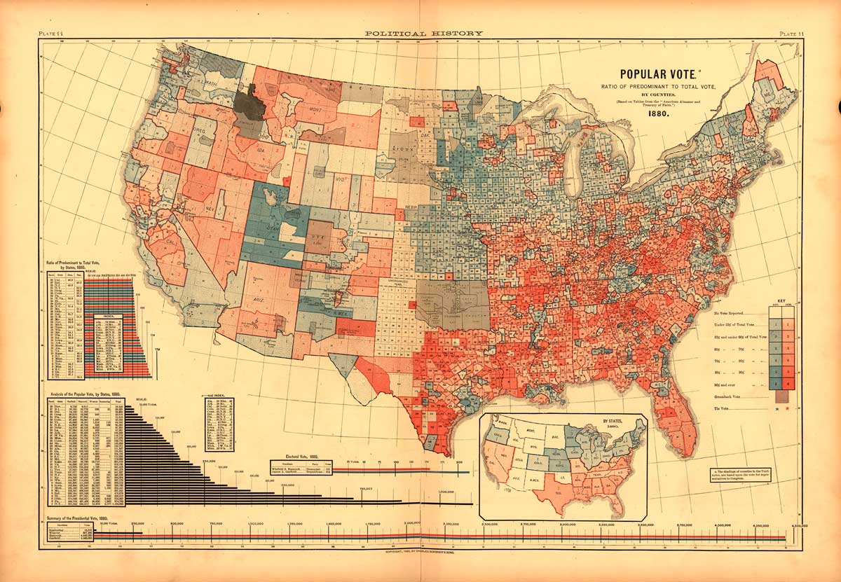
Historian and professor Susan Schulman stumbled onto an 1880 electoral map in her research last year, buried in an 1883 book called Scribner’s Statistical Atlas of the United States. The Library of Congress has digitized the whole book, and it’s dripping with statistical tables and maps outlining the state of the still-incomplete nation.
But the electoral map — the first in a three-election series — caught Schulman’s eye.
She wrote about it for The New Republic on Monday.
The map may not look advanced today, but in 1883 it broke new ground by enabling Americans to visualize the spatial dynamics of political power. Readers responded enthusiastically. … [T]he map revealed spatial patterns and relationships that might otherwise remain hidden, or only known anecdotally.
For the modern observer, one immediate thing jumps out: This looks a lot like the way we imagine our modern presidential map to look. Blue states in the Northeast, red states in the South. A bright blue Utah is an anomaly, sure, but the rest matches up neatly.
The next thing that jumps out is that the colors have been swapped. Blue, on the Scribner’s map, denotes Republicans, as did most maps in the media prior to the 2000 election. (Here’s that history.) But we don’t have readily available maps showing a county-by-county breakdown with the colors reversed.
More From The Washington Post:


